Notice what your thumb opens first
A phone home screen is a small environment designed for repeated use. If the first page is filled with bright badges, news tiles, shopping icons and social apps, your attention is already being pulled in several directions before you decide why you picked up the phone. A calmer screen does not make you more disciplined by magic. It changes the number of prompts you have to ignore.
For two days, notice the moment before you open an app. Were you checking a message, looking at the time, starting a task or filling a pause? The difference matters. A useful tool you need for work should remain easy to reach. An app you open automatically when tired may belong somewhere less prominent, even if you still want to keep it installed.
Write down the five actions you want the first screen to support. They might include calling a person, checking a calendar, opening a map, listening to music or taking a quick note. Do not begin by deleting everything that feels distracting. Start by making the useful actions clear, then decide where the rest should live.
Give the first page a single job
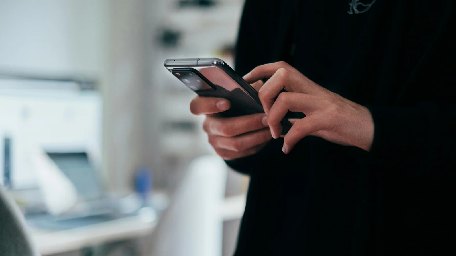
Choose a job for the first page, such as communication and planning, or daily utilities. Keep only the apps you use for that job within easy reach. If you regularly need a second set of tools, put them on another page or in a clearly named folder. The point is not to reach a universal number of icons; it is to make the first glance easier to understand.
Put the apps you use most in stable positions. If an icon moves because of recommendations, updates or automatic sorting, your hand has to search for it again. A small, deliberate layout can reduce that friction. Use a folder for apps you need occasionally, such as travel, finance or home maintenance. Name it by the task it supports, not by a vague label such as “More”.
Consider removing apps from the home screen without uninstalling them. Many phones allow you to keep an app in the app library or drawer while removing its icon from the first page. That preserves access while reducing the chance of opening it on impulse. Keep essential tools easy to find elsewhere so the screen remains usable rather than becoming an obstacle course.
Remove badges that do not carry useful information
Notification badges can make a screen feel unfinished. A red number may represent an unread message, a delivery update, a marketing prompt or an item that will never matter. When every app can place a badge on the home screen, the number stops helping you prioritise.
Review permissions by category. Keep alerts that need timely action, such as a family message, a work call or a transport update you are actively using. Turn off badges for apps where the content can wait until you choose to open the app. If you worry about missing something important, leave the notification itself available while removing the icon badge, or use a scheduled summary where your phone supports it.
Treat the lock screen and home screen separately. A notification that appears while the phone is locked can interrupt a conversation even if the app is not on the first page. Decide whether each category should appear as a banner, a quiet list, a badge or not at all. The right choice depends on the consequence of missing it. A bank security alert is different from a daily offer.
Do not turn off every notification in one sweep if you depend on the phone for safety, care or work. Make a short list first, then test the change for a few days. You can restore an alert if the absence creates a real problem. The aim is fewer irrelevant prompts, not less access to people who rely on you.
Make focus modes match real situations
Focus or do-not-disturb modes can create a quieter screen during work, rest or travel. Build modes around situations that already occur rather than ideals you rarely keep. A work mode might allow calls from selected contacts and calendar alerts while hiding entertainment apps. An evening mode might silence group notifications but leave family messages available.
Some phones let a focus mode change which home-screen pages are visible. If yours does, create a page with only the tools needed for that situation. Keep the configuration simple. A mode that requires several taps and rules to activate will be forgotten on a rushed morning. Automatic schedules can help when your week follows a pattern, but leave an obvious way to turn the mode off when the day changes.
Review the allowed people and apps carefully. An exception list that includes every service defeats the point. Start with the people and alerts that have a genuine reason to reach you immediately. You can check non-urgent messages when you choose. If you share care responsibilities, agree on a route for urgent contact before silencing a device.
Menu names and exact controls differ between Android phones and iPhones, and may change across software releases. Search the current settings on your own device rather than relying on a path written for a different version. The principles remain stable: choose who can interrupt, choose which apps can appear and make the active mode visible.
Reduce visual noise without hiding essentials
Wallpaper influences how quickly icons and labels can be scanned. A busy image behind the icons creates another layer of detail. Try a photograph with a quieter area behind the app grid or a simple colour that you like looking at. The goal is not to make the phone look minimal; it is to make labels readable and important controls easy to spot.
Widgets can replace several taps, but a screen full of updating information can become another source of distraction. Keep a widget if it answers a question you ask often, such as the next calendar item or current weather before a walk. Remove it if it encourages you to check a feed without a clear reason. A static reminder may be calmer than a stream of content.
Look at the screen in grayscale only as a short experiment, if your device offers it. Removing colour can reduce the visual pull of certain apps, but it can also make maps, accessibility cues or status information harder to read. Test it during a low-risk period and return to your normal display if it makes important tasks more difficult.
Accessibility is part of calm. Larger text, stronger contrast, reduced motion or voice access may make a phone easier to use, even if the result looks less sparse. Do not sacrifice readability for a design trend. A useful screen should be comfortable for your eyes and hands.
Put distracting apps one step farther away
If you open a particular app by reflex, add a small amount of friction instead of relying on willpower. Move it from the first page to a folder, turn off its badge or sign out if logging in is a useful pause. The extra step gives you a moment to ask whether you meant to open it.
Avoid hiding tools you need in an emergency or for essential daily tasks. The friction should match the app’s role. A game or shopping feed can sit farther away; a map, accessibility tool or health-related app may need to remain direct. Be honest about the difference between an app that interrupts you and one that makes the phone work.
Time limits and app timers can be useful reminders, but they may be easy to dismiss. Choose a limit that creates awareness rather than a rule that prevents an important task. If a timer does not change the habit, try a different boundary: move the app, remove notifications or set a specific time to check it.
Keep the layout steady for a week
Once the first page feels workable, keep it unchanged for a week. Moving icons every day defeats the point of stable positions. When an app is missing, notice the moment you need it and whether it belongs on the first page, in a folder or simply in search. Add only the tools you use repeatedly.
At the end of the week, check which icons you actually opened and which badges still mattered. A home screen is a practical arrangement, not a test of your character. If a change makes the phone harder to use, reverse it. If you find yourself reopening a distracting app by habit, add a modest pause rather than adding another layer of rules.
You may find that the best first screen is less minimal than you expected. A parent who needs quick access to school messages, a commuter who uses tickets and maps, and a freelancer who relies on calls have different needs. Keep the tools that support your day and remove only the prompts that make it noisier.
Revisit the screen when your routine changes
A home screen that works during a work week may not suit a holiday, a new job or a change in caring responsibilities. Review focus modes and notification permissions after a meaningful change. Remove temporary travel or event widgets when they are no longer useful. This small review prevents old settings from becoming invisible clutter.
Do not aim for a phone that never attracts attention. Phones are built to connect you with other people and services, and some interruptions are valuable. A calmer home screen helps you notice the difference between an alert you chose and one you do not need right now.
Start with the first page, silence only the badges that add no value and create one focus mode for a real part of your day. After a week, keep what made the next action clearer. A good setup should feel easier to live with, not like another optimisation project you have to maintain.